How to interpret Google Analytics reports to make data-driven decisions
⚠️ All rights reserved. Cite this piece as 'ONDA (온다)' when quoting.
Hey there. This is ONDA, the B2B hospitality platform leading the digital transformation of Korea's lodging industry.
Today we're covering how to interpret Google Analytics reports.
You can set up Google Analytics perfectly, but if you can't read the reports, you won't find the insights that boost conversion. Makes sense, right?
When you first open a fully configured Google Analytics dashboard, it's normal to feel overwhelmed by all the numbers and cryptic English terms flying around. But don't worry — even as someone who gave up on math (a certified "math dropout"), I can read GA reports just fine.
So let's break down Google Analytics reports step by step.
(If you want to see what data you can access before setting up your own GA, check out Google's demo account.)
The 5 Categories in Google Analytics Reports

When you log into Google Analytics, you'll see the left sidebar organized into five main report categories: Home, Customization, and three others. Let's quickly run through what each section covers — it'll help you navigate faster.
1) Real-Time
Real-Time reports show you right now — who's on your site, where they came from, and which pages they're viewing.
2) Audience
Audience reports tell you who your visitors are — their age, gender, device, interests, and other characteristics.
3) Acquisition
This is probably the section most people want to see first: where your traffic is coming from.
4) Behavior
Behavior reports show what users are doing — which pages they visit, where they drop off, and how long they stick around.
5) Conversions
All the other categories matter, but I think Conversions is the most important. It shows how well you're hitting your key goals — things like account sign-ups or completed bookings.
Real-Time > Overview
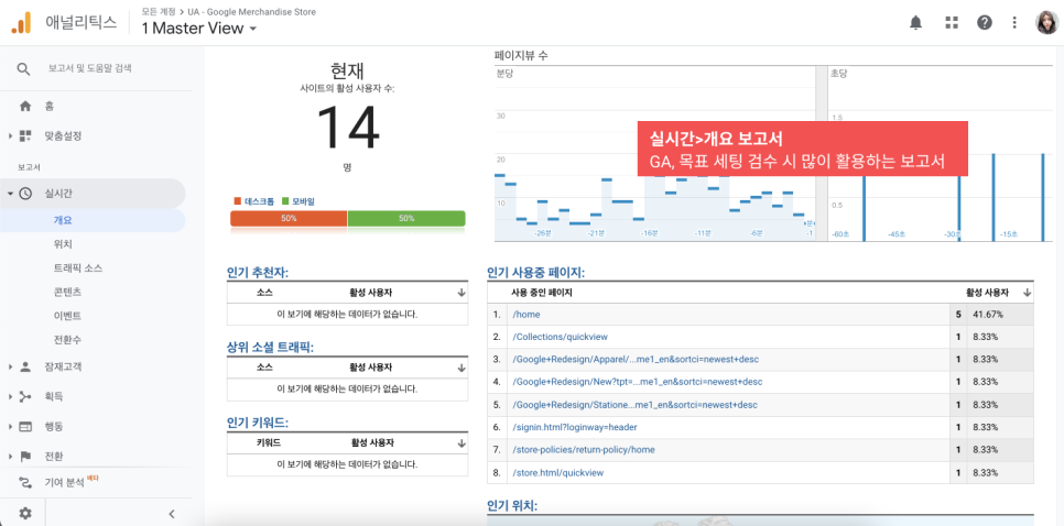
To be honest, I don't use Real-Time reports all that often. They only show you this instant — not enough data to draw meaningful insights. Real-Time is mostly useful when you're setting up GA or testing goals to make sure the tracking works properly.
Audience > Demographics
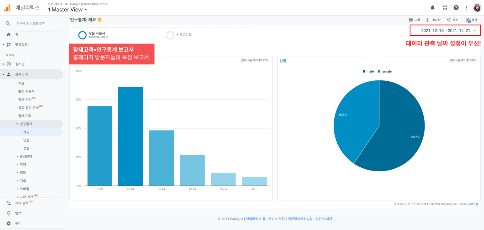
If you click into Audience, you'll see a long list of subcategories. Under Demographics > Overview, you can view breakdowns by gender and age. Unlike Real-Time, there's something critical you need to check with other reports: the date range in the top right corner. You're looking at a specific time window, so if you don't set the date carefully, you'll be reading the wrong data.
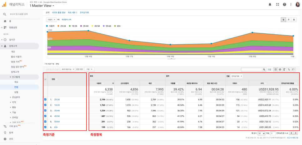
The Demographics > Age report looks a little different from what we've seen so far, right? It's a data table. You'll see this format a lot, so it's important to understand how it's structured. The leftmost column ("Age") is the dimension — the lens you're looking through. The numerical columns to the right (Users, New Users, Sessions, etc.) are metrics — the numbers being measured. Every data table in Google Analytics is built on dimensions and metrics.
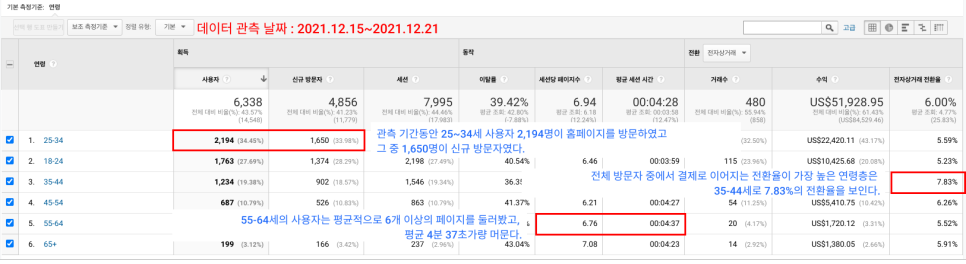
Now let's read the table. The date range is December 15–21 (one week).
• Between December 15–21, 2,194 users aged 25–34 visited our website.
• Of those, 1,650 were first-time visitors.
• Users aged 55–64 viewed an average of 6+ pages and spent about 4 minutes and 37 seconds on the site.
• The age group with the highest conversion rate is 35–44, at 7.83%.
Remember from a previous post that knowing your visitors' age and gender can help you target ads more effectively?
Let's see how we'd use this table to make a decision.
The most important metric here is conversion rate. The 35–44 age group has the highest conversion rate, but they're only the 3rd-largest group by user count. To drive more revenue, we need more of these high-converting users on the site — but right now, they're underrepresented.
So here's what you could do: adjust your ad targeting to focus on the 35–44 demographic. For example, run a campaign or event that appeals to them, or place ads on platforms and communities where they spend time.
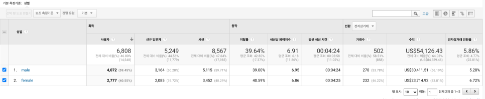
Beyond age, you can also explore gender, device, and many other dimensions. When you know who your visitors are, you can make better, data-driven decisions.
Acquisition > Channels
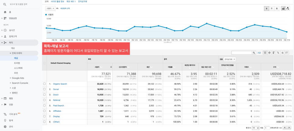
If you're running ads across multiple channels, don't miss the Acquisition > Channels report. It shows where your traffic is coming from — which channels are sending people to your site.
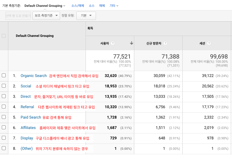
The dimension here is "Default Channel Grouping," which is Google Analytics' pre-set classification of channels. Some of these terms may be unfamiliar, so let's define them:
• Organic Search — Traffic from search engines (Google, Naver, Daum, etc.) via unpaid search results.
• Social — Traffic from social media platforms (Facebook, Instagram, Twitter) via shared links. If you're running social ads, this is where they'll show up.
• Direct — As the name suggests, direct visits. This includes users who type your URL directly, use a bookmark, or come from a source GA can't identify (like text messages).
• Referral — Traffic from external websites that linked to your site. For example, if someone writes a hotel review on their blog and includes a link to your site, clicks from that link count as Referral.
• Paid Search — Traffic from paid search ads (e.g., Naver Power Links).
• Affiliates — A subset of Referral traffic, but specifically from sites you've designated as partners or affiliates in your GA settings.
• Display — Traffic from Google Display Network banner ads.
• Other — Anything that doesn't fit the above categories.
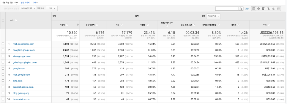
Click into any Default Channel Grouping and the dimension switches to "Source," showing you more granular detail. The image above shows what you see when you click Referral. You can identify which specific sites drive the most traffic and conversions — then use that insight to decide where to advertise or form partnerships.
Behavior > All Pages
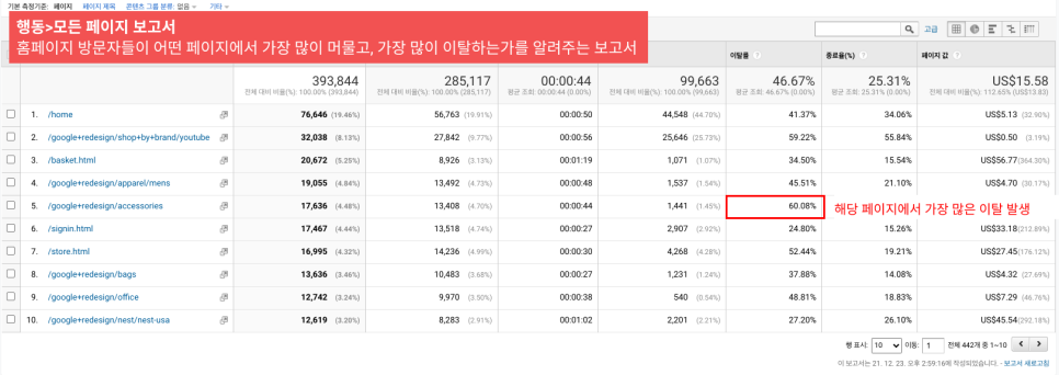
This report shows which pages users are viewing — and where they're dropping off. You can see how long people stay on each page and what the bounce rate is.
The dimension here is "Page." You might be thinking, "Wait, I only have one website — what are all these pages?" Well, yes, you have one site, but inside that site are many individual pages (or "subpages").
For example: homepage, sign-up page, login page, booking page, booking confirmation page, etc. Each of these is a subpage, and each one becomes a dimension in this report.
In the image, the page with the highest bounce rate is /google+redesign/accessories. We don't know what's on that page, but clearly a lot of people are closing their browser there. That's a signal: you should improve that page to keep users engaged longer.
Conversions > Overview
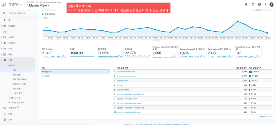
The Conversions report is the most important one, as I mentioned earlier. It shows how well you're achieving your key goals. In the Overview, you can see how many times each goal was completed and which pages contributed to those completions. Any goals you configured in a previous setup will show up here.
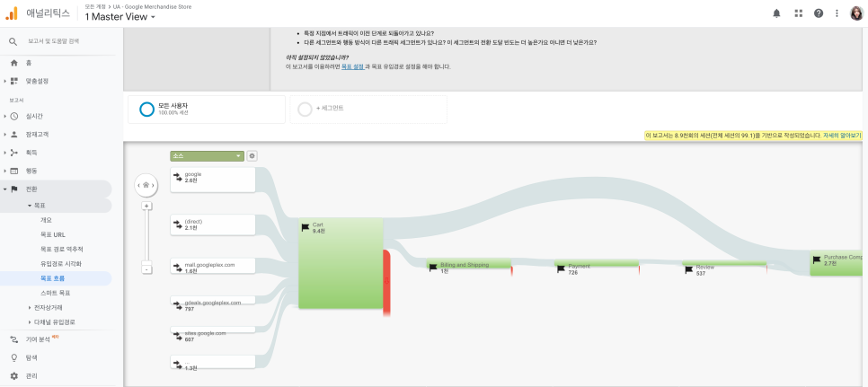
The Goal Flow report in Conversions visualizes something different from the tables we've seen so far. It shows the path users take from entry to goal completion — and where they drop off along the way.
In this example, users arriving via Google move through stages like Cart, Billing and Shipping, and eventually reach the goal. You can see the drop-off at each step. Goal Flow helps you answer questions like:
• At which stage are users abandoning the funnel?
• Where is traffic looping back to a previous step?
Not so intimidating once you break it down, right?
With Google Analytics, you can stop relying on gut feeling and start making decisions based on real data. When you analyze your reports, always keep "How can we improve conversion rate?" top of mind — that's the question that matters most.